
Key Takeaways
- It is crucial to make PDF documents with diagrams accessible to people with visual impairments, as around 2.2 billion individuals worldwide suffer from vision impairments.
- Before publishing a PDF document with diagrams, it is essential to verify its accessibility using an in-built accessibility checker tool.
- Descriptive hyperlink text is crucial for adding hyperlinks to diagrams and charts to ensure users receive clear and accurate information about the destination page.
- Summarizing the key points in the title before creating a chart is recommended, as it makes the chart more effective and easier to understand.
- Adding alt-text and image descriptions to graphs, shapes, and diagrams can help users with visual impairments to understand the content of diagrams and charts.
- It is essential to adhere to color contrast guidelines, opt for a single-hue palette, includes non-color elements, and ensure keyboard-only accessibility when creating diagrams and charts to make them more accessible to individuals with visual impairments.
Introduction
PDF documents with diagrams are widely used to give users a visual experience. Hence, it is crucial to consider whether these documents are accessible to people with visual impairments. According to the eleventh revision of the International Classification of Diseases (ICD-11), there are two groups of visual impairments — distance visual impairment with mild, moderate, and severe blindness, and near-vision impairment who have difficulty with close vision tasks such as reading.
It is worth noting that roughly 2.2 billion individuals worldwide suffer from vision impairments. Consequently, it is crucial to include accessible diagrams and charts in PDF documents to ensure data is accessible to all users, regardless of any disability they may have. By following a few simple steps and adhering to the Americans with Disabilities Act (ADA) guidelines, it is possible to create diagrams, charts, and graphs that align with accessibility standards and enhance the reading experience for everyone. In this article, we will explore the process of remediating PDF documents with diagrams to make them more accessible to all users.
Verify Diagram Accessibility with Accessibility Checker
Ensuring the accessibility of a PDF document with diagrams is crucial before publishing it. An in-built PDF accessibility checker tool can aid in identifying accessibility issues with your document, including diagrams, graphs, and charts. The tool’s primary function is to verify if the diagram is accessible and highlight potential problems hindering accessibility for individuals with disabilities. Additionally, the tool explains the issue and offers suggestions for addressing and resolving it.
Include Accessible Hyperlink Text in Your Content
Incorporating descriptive link text is crucial when adding hyperlinks to your diagrams and charts, as it ensures that users receive clear and accurate information about the destination page. By doing so, individuals who use screen readers can easily navigate your document, significantly enhancing its overall accessibility. Rather than relying on generic terms such as “Click here,” “Go here,” or “Learn more,” it is best to use the full-page title as the hyperlink text. This approach lets screen reader users grasp the link’s context and navigate your document effectively. As a result, users of all abilities can enjoy a seamless reading experience when accessing your PDF document with diagrams.
Summarize the Key Points in your Takeaway Title
Compose Alt-Text and Image Descriptions to Enhance Diagram Accessibility
Adhere to Color Contrast Guidelines to Improve Visibility
Incorporating appropriate color contrast guidelines, such as the Web Content Accessibility Guidelines (WCAG), is essential for creating diagrams and charts that are accessible to users with color blindness or low vision. Adhering to these guidelines ensures that the text and data are distinct from the background, improving visibility for users with different visual abilities. The two most commonly used color contrast levels are AA (minimum contrast) and AAA (enhanced contrast).
Opt for a Single-Hue Palette to Simplify the Design
When creating diagrams, it’s important to consider users with color blindness and ensure that the content remains accessible. If color is a critical element in your diagrams, a single-hue palette is recommended to ensure easy differentiation for low-vision users. It is also essential to avoid using red and green together, as they can be particularly challenging for individuals with deuteranopia or protanopia.
Include Non-color Elements for Added Accessibility
Ensure Keyboard-only Accessibility for All Users
Prioritize Static Visualizations for Optimal Accessibility
Enhance The Screen Reader Experience with Thoughtful Design
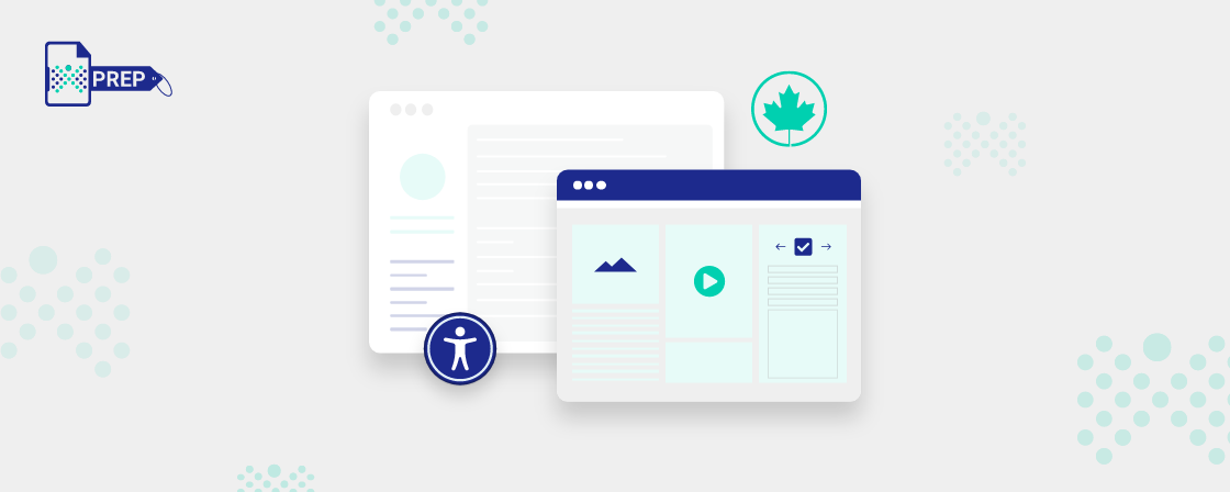
PREP- PDF Remediation Tool and its Services
In today’s digital world, insurance companies must provide accessible and equitable healthcare to all customers, including those with disabilities. However, creating accessible digital content can be challenging due to a lack of expertise, high costs, and long turnaround times. That’s where Continual Engine’s AI-driven document remediation service, PREP, can help.
PREP offers an innovative solution for businesses looking to improve the accessibility of their digital content. Their AI-powered technology automates and accelerates PDF and document remediation for complete ADA and WCAG compliance. With PREP, businesses can easily convert multiple document formats while addressing varied user needs.
One of PREP’s key features is its auto-tag detection capability, which quickly tags complex documents and reduces manual time spent, resulting in significant cost savings. PREP’s cloud-based platform also allows collaboration on accessibility projects and offers a user-friendly interface for swift onboarding. Its sophisticated technology, combined with a human-centered design approach and scalable solutions, makes it easy and affordable for businesses across various industries to achieve compliance with accessibility standards.
By partnering with PREP Remediation Services, insurance companies can benefit from faster, easier, and more scalable accessibility solutions. PREP’s service can help achieve regulatory compliance criteria and make financial statements, communication processes, and banking statements accessible. Digitizing and making all business collaterals accessible can provide a positive user experience.
To see how PREP Remediation Services can help you achieve your organization’s accessibility goals, register for a free demo today! Visit our website to know more!
Final Thoughts:
Transform with Affordable Document Remediation
Experience top-tier PDF remediation powered by AI, delivering unmatched quality, precision, and scalability, all at a fraction of traditional time and cost.
