
United States: Accessibility Laws and Guidelines
-
1. Americans with Disabilities Act (ADA)
The ADA focuses on preventing discrimination against people with disabilities in all areas of public life, including online content. This means your documents and digital resources should be usable by everyone.
-
2. Web Content Accessibility Guidelines (WCAG)
WCAG offers a global set of guidelines to make web content, including documents, more accessible. It focuses on making content perceivable, operable, understandable, and robust for users.
-
3. Section 508 of the Rehabilitation Act
This rule applies to federal agencies, ensuring their digital content and technology are accessible to people with disabilities. It overlaps with WCAG but is specific to government-related content.
Canada: Standards Promoting Inclusion
-
1. Accessibility for Ontarians with Disabilities Act (AODA)
AODA requires organizations in Ontario to make digital content accessible to individuals with disabilities. It applies to businesses, non-profits, and public organizations.
-
2. Accessible Canada Act (ACA)
This is a federal law that aims to remove barriers for people with disabilities across Canada. It covers accessibility in areas like technology, documents, and communications.
Europe: Building Inclusive Digital Experiences
-
1. European Accessibility Act (EAA)
The EAA ensures that products and services across Europe, including digital content, are accessible to everyone. This law supports uniform standards for accessibility across EU nations.
-
2. EN 301 549 (EU Accessibility Standard)
This technical standard outlines how public sector websites and documents should meet accessibility requirements. It’s based on WCAG but adapted for European laws.
-
3. Germany: BITV (Accessible Information Technology Regulation)
BITV is Germany’s approach to document and website accessibility. It focuses on making public sector digital content easy to use for individuals with disabilities.
Australia: Accessibility in Focus
-
1. Australian Disability Discrimination Act (DDA)
The DDA requires businesses and organizations to ensure their digital content, including documents, does not exclude people with disabilities.
-
2. PDF/UA (PDF Universal Accessibility)
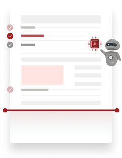
PDF/UA is an international standard that focuses on making PDF documents accessible. It ensures proper tagging, navigation, and usability for assistive technologies like screen readers.
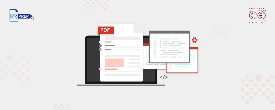
 PDFs
PDFs
 Microsoft Office Documents Microsoft has a famous and widely used Microsoft 365 Office suite with valuable software like Word, Excel, and PowerPoint. To make documents made in any of these software accessible, below are the appropriate steps to follow:
 Google Workspace Like Microsoft, Google Workspace also offers an office suite containing Docs, Sheets, and Slides. Let’s take a look at how you can make documents accessible in this workspace:
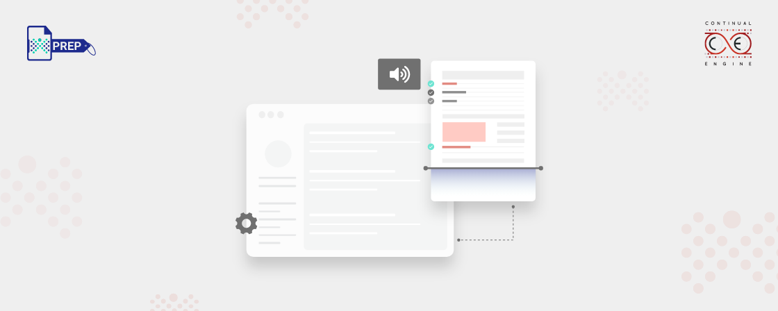
 Web Documents
Use Clear and Simple Language
To make your document easy to understand, use simple and clear language. This means writing in a way that anyone can get the message on their first read. The goal is to be straightforward, so readers don’t get lost in complex words or phrasing.
Here are some tips for clearer communication:- Keep sentences short – ideally 15 to 20 words.
- Avoid long sentences with too much information; try not to list more than three points in one sentence.
- Use active verbs instead of passive ones. For example, say "We will send you an appointment" (active) instead of "An appointment will be arranged for you" (passive).
- Stay away from acronyms and jargon. If you have to use them, explain them when they first appear.
- Use bullet points to break down complicated details and make the text easier to follow.
Read more about “What is Plain Language in Accessibility?”