

What is Color Accessibility And Why Does it Matter?
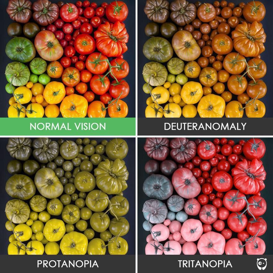
Color accessibility means designing digital content in a way that ensures individuals with color vision deficiencies can perceive and understand the information accurately. This includes considerations such as adequate color contrast and the use of alternative cues to convey meaning. Colorblind accessibility is essential for enhancing user experience and promoting inclusivity on the web. By adhering to accessibility standards such as WCAG (Web Content Accessibility Guidelines), designers can ensure that their websites are accessible to a wider audience.
Common Mistakes In Color Accessibility
Insufficient Color Contrast
Insufficient color contrast for accessibility can make content hard to read, especially for users with color vision deficiencies. To address this issue, designers should aim for adequate color contrast ratios to comply with accessibility standards.

Poor Color Combinations
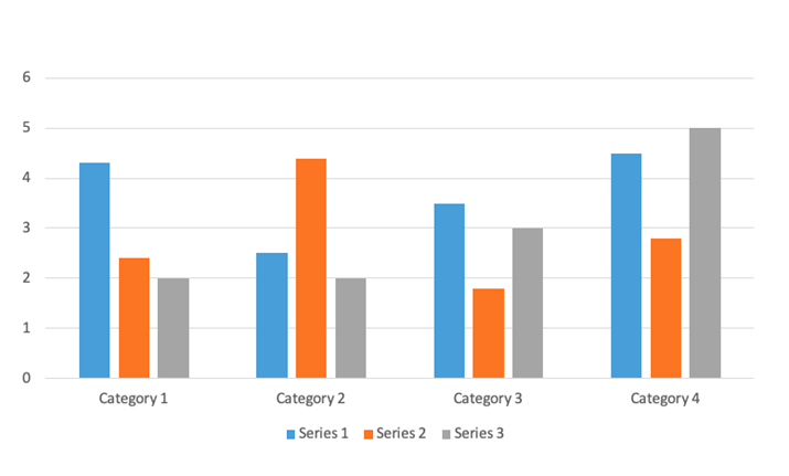
Graphs And Charts
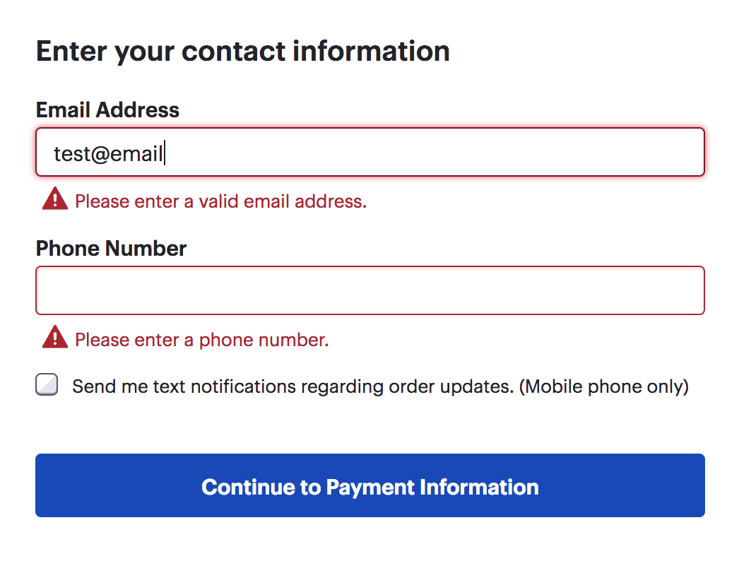
Errors Being Conveyed Using Color
Color-Dependent Text Markup

URLs Being Identified Using Color Alone

Not Providing Text Labels
Creating More Color Accessible Designs
1. Use Adequate Color Contrast
2. Select Complementary Colors
3. Provide Alternative Text
4. Use Patterns And Textures
5. Supplement Color Cues With Additional Indicators
6. Avoid Using Color Alone
7. Create A Color Palette
8. Test For Accessibility
Final Thoughts
In conclusion, prioritizing color accessibility in web design is essential for creating more inclusive and user-friendly websites. By addressing common mistakes, implementing best practices, and utilizing accessibility solutions such as from Continual Engine, designers can ensure that their websites are accessible to everyone, regardless of their abilities.
Interested In Learning More About Accessibility Solutions?
Stay in the know and be updated about the latest advancements and trends with Continual Engine!
